Copper Leg Departure Day Thoughts
I have now spent almost two weeks in Estonia at the Copper Leg Art Residency. This cultural center, maintained by the municipality of Rae, offers residencies to artists from various disciplines. I came here to make traditional black-and-white prints and, in doing so, develop as a visual artist. Copper Leg has a well-equipped darkroom that suited my needs perfectly.

Copper Leg Residency in an Old School Building
I woke up around seven in the morning, made a quick bowl of oatmeal, and headed downstairs to the darkroom to work. I spent the entire day there, except for a brief noodle break—many evenings, I stayed until ten. On several days, I didn’t even step outside.
The first few days felt rather pointless. Why did I come here? After all, I could have printed at home in my own darkroom. But fortunately, after a few days, I got into the flow. Being able to work uninterrupted and focusing all my energy on making images is an incredible privilege. One day, I spent thirteen hours on a single print. And now, on my departure day, I feel like I could have continued even longer.
Many of the lessons I learned about printing will probably become clearer later. Right now, the main things on my mind are image size, variable contrast printing, toning, and understanding why some images work as prints while others don’t. It was particularly interesting to think about these things because the images I was printing had no specific destination. I hadn’t sold them in advance, they weren’t intended for an exhibition, and I hadn’t planned to hang them on my walls. The entire process was purely about the image itself, without considering its utility.
Thoughts on Image Size
My first realization is about image size. I typically shoot traditional square-format photographs. Most of my prints were 30x30 cm, but as I worked, I also started printing smaller 16x16 cm images by creating a stencil in the center of an 18x24 cm sheet of paper. I ended up preferring these smaller prints.
I now feel that a print should have a purpose that determines its size. A large 1x1 meter print is impressive on a wall, integrating the image into the space. A small 16x16 cm print, on the other hand, is an intimate, personal experience—it can be placed on a table or held in hand. A 30x30 cm print falls somewhere in between; it’s too large to be held comfortably, and on a wall—especially without proper framing and a passe-partout—it often looks somewhat undersized. I now believe that prints should be either large or small—nothing in between.

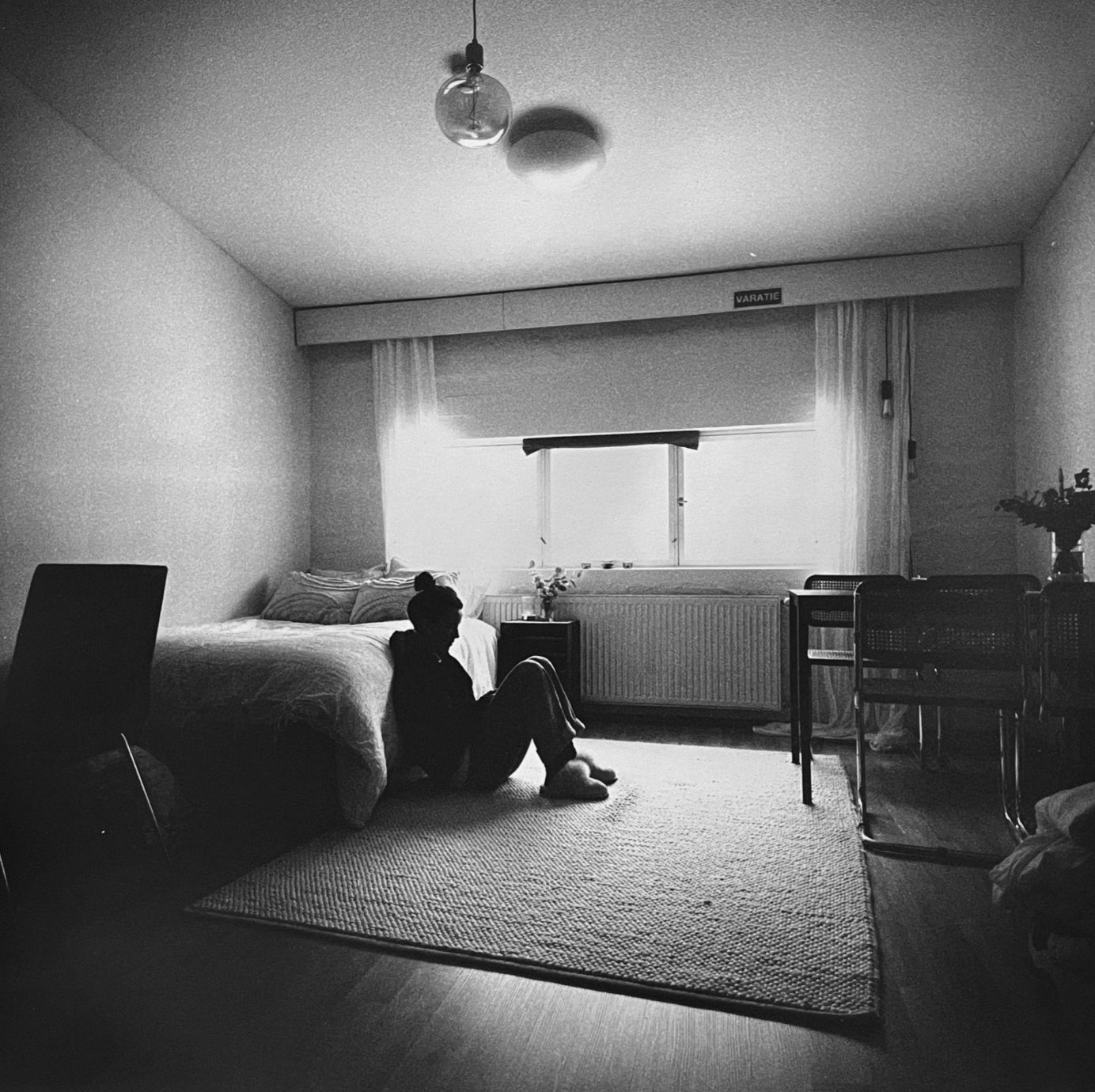
A hand-held photograph
The Expressive Power of Split-Grade Printing
The second lesson I took from this experience was the expressive power of variable contrast printing, also known as split-grade printing. This method involves exposing multiple contrast levels onto the same photographic paper. The goal is typically to use a low-contrast exposure to bring out details in highlights, while a high-contrast exposure ensures deep blacks and bright whites, adding strength to the image. Over these two weeks, I developed a solid routine for this technique and found myself using it for most of my prints.
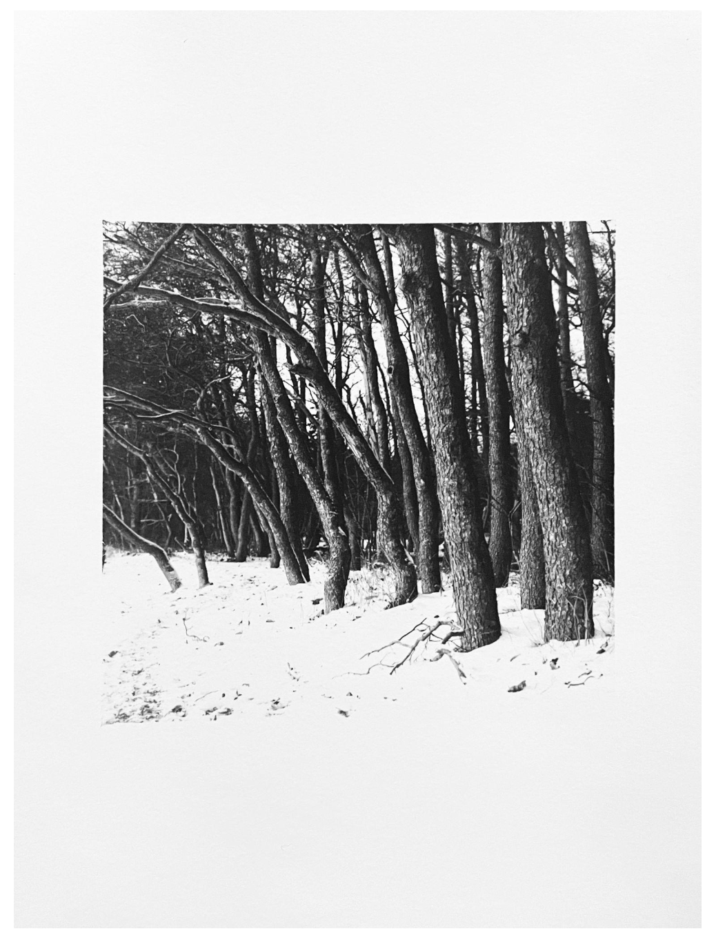
A pressed (ISO 400 ⇒ ISO 6400) negative with split-grade printing for shades and black
Experimenting with Toning
The third area I explored was toning prints. I immersed still-wet prints in strong coffee or black tea. Tea gives the images a beautiful golden hue. I’m not entirely sure if this approach suits my style, as I also love the look of pure white paper. But it was fun to experiment, and I might return to it in the future.

An image stained with strong black tea
Understanding Image Suitability
The fourth lesson is still forming in my mind—it relates to how images suit different purposes. An image that works well on Instagram may look dull or uninteresting as a print. On the other hand, when an image is turned into a physical object, it gains a tangible presence beyond its visual qualities.
This time, I printed exclusively on thick, matte, fiber-based photographic paper (Fomabrom 112), which significantly influenced the image’s appearance. I’m still figuring out whether I can develop a personal set of guidelines for this. A large print can hold a great deal of detail, while otherwise dull surfaces become intriguing in a physical print. Since light falls on a print from the front rather than being emitted from behind, as with digital images, the image exists in a different universe. It becomes part of the same space we inhabit rather than existing in the artificial reality of social media. These factors influence an image more than I sometimes realize.
A picture with texture in the center
Wrapping Up
Soon, I’ll pack my car and head home. This entire trip has been a significant time investment, but it now feels like it was absolutely worthwhile. I believe the true benefits will become clear later as I review my prints at home and reflect on my experience.
And, of course, a special thanks to Niina-Anneli Kaarnamo, who provided an uninterrupted work environment and a pleasant workspace! Out here in an Estonian field, in the middle of nowhere, it was wonderful to focus on the most crucial phase of photography—printing.
Ari Jaaksi